Top furniture trends 2019
COLOURS
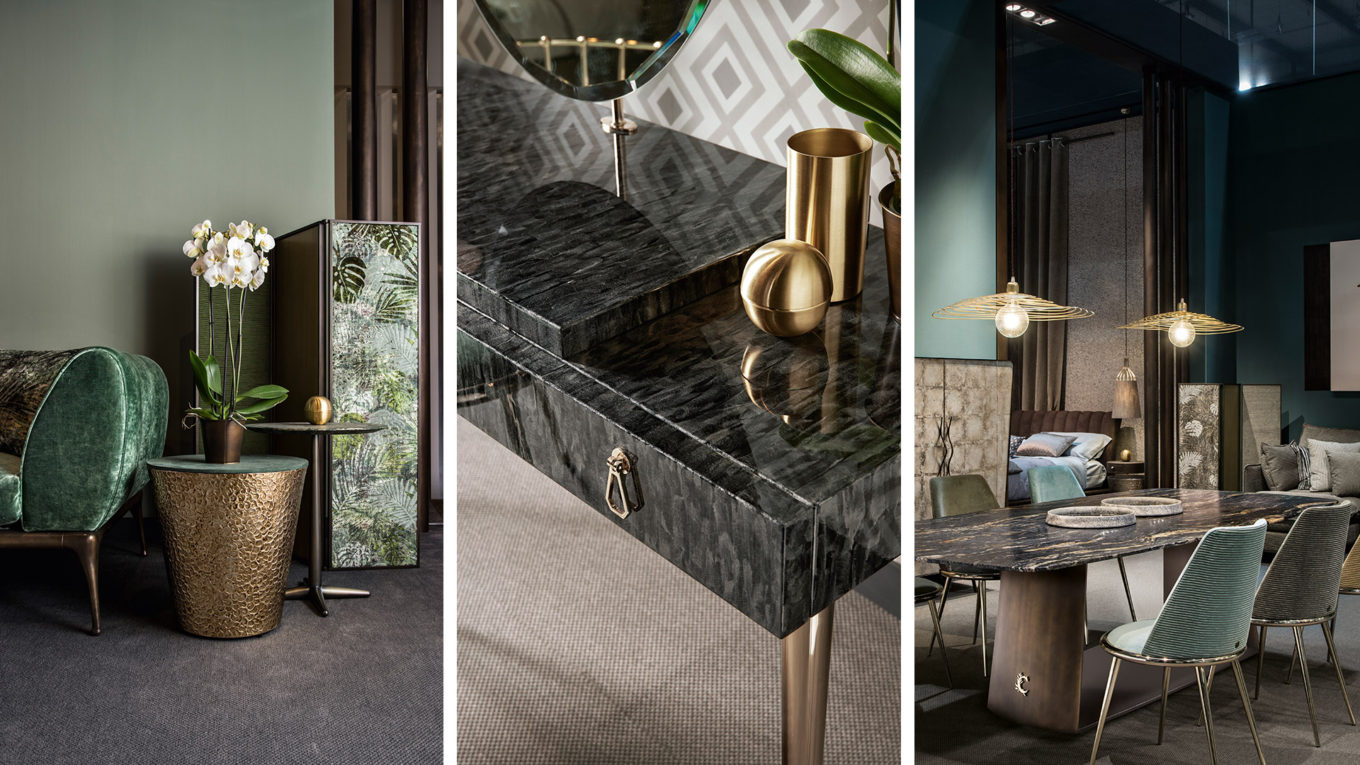
INTENSE COLOURS ARE A MUST this year: no more pastel nuances.
Laurie Pressman, Vice President of the Pantone Colour Institute stated: "The PANTONEVIEW home + interiors 2019 guide is inspired by a theme: concentration. Because of the infinite choices, it is necessary to focus on the eye-catching colours. The Pantone guide is a journey through colours that unlocks a different future, where imagination has more room to run free".
Pantone View Home-Interiors 2019 published its new palettes, which highlight the 2019 colours trend.
The first three are the most interesting suggestions:
- CRAVINGS: palettes with oriental, spicy and vibrant influences.
- CLASSIC: timeless colour palette.
- MEANDERING: collection of journeys.
1. CRAVINGS: palettes with oriental, spicy and vigorous influences
CRAVINGS: Butterscotch, Cappuccino, Chilli Pepper, Flamingo, Grass Green and Cayenne are some of the colours in this palette. Red, orange and deep purple are the warm colours in it. A collection where oriental atmospheres are evoked and the colours of spices are the protagonists, together with warm, earthy shades of brown, that give an elegant connotation to the space, and green, which can make your own living room more closely connected with nature.
2. CLASSIC: timeless colour palette
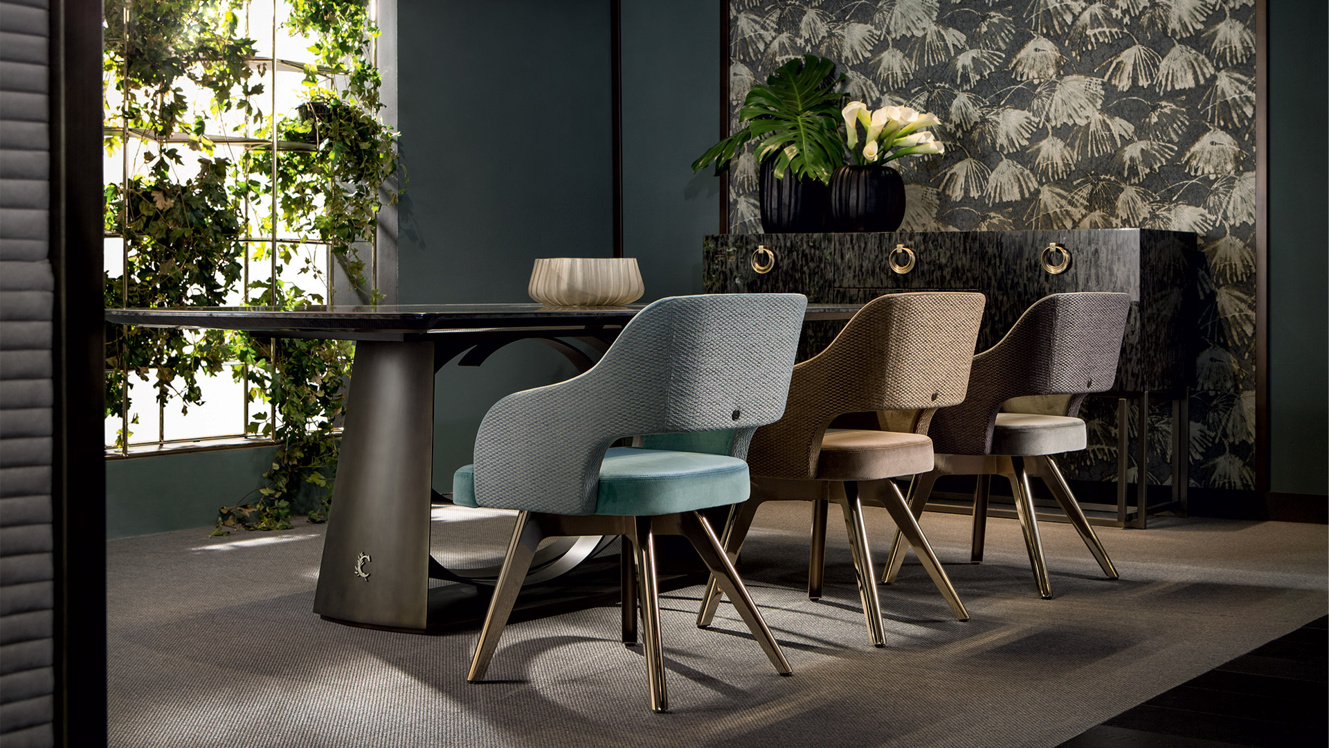
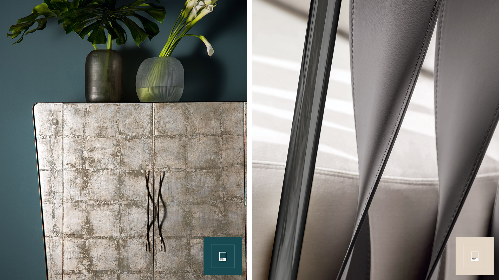
CLASSIC: Deep Teal, Apricot Brandy, Grey Flannel and Caviar - a mix of timeless shades, a revival of tradition, elegance and style.
Soft tones: delicate and yet capable of creating a fantastic contrast of colours in the living area.
It is a palette that combines very different shades: from white to caramel, from grey to green, black and burgundy. Colours that can be adapted to different space-settings and furnishing solutions. The tones of beiges, when lightened up by soft lights or sunlight coming from a window, seems to be able to soften all interiors, gently caressing furniture, walls and floors for the softest and most romantic.
3. MENADERINGS: Collection of journeys
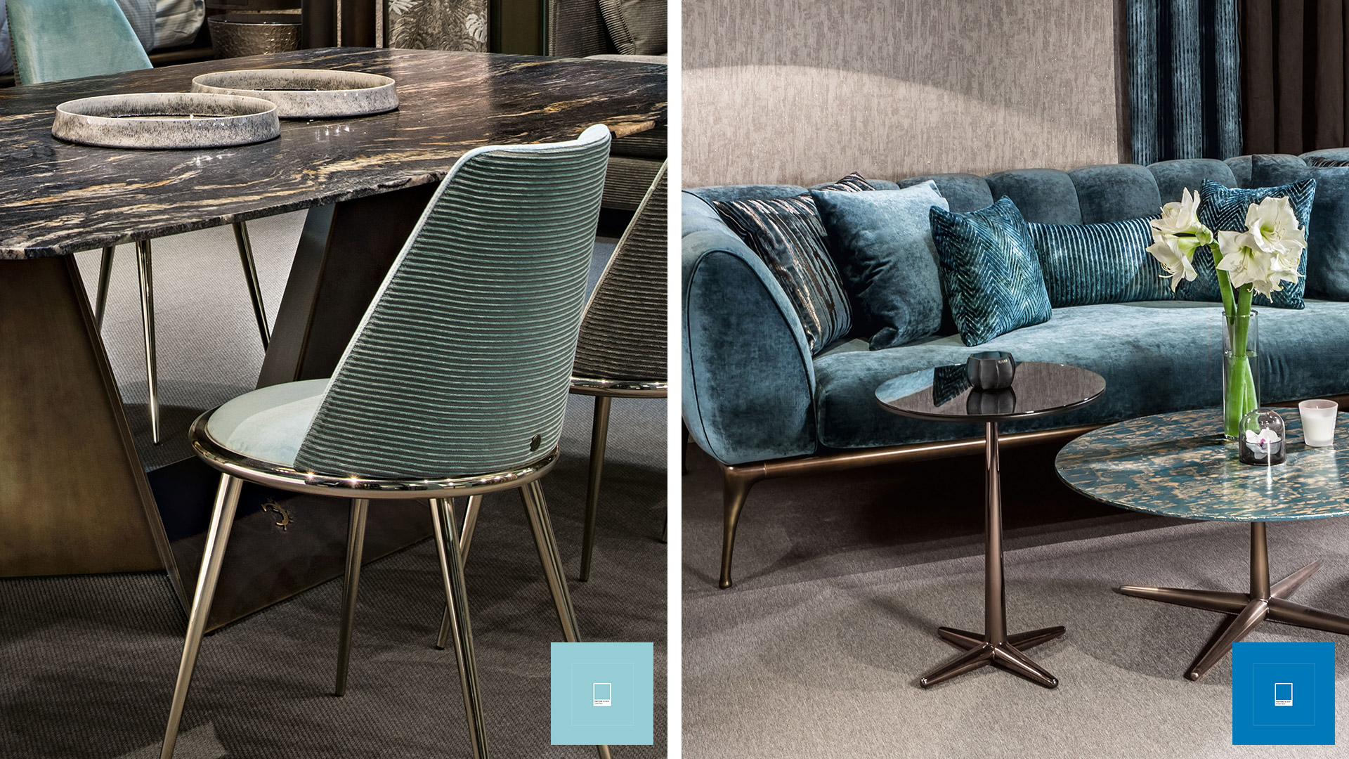
Feelings evoked from art sculptures, exotic sensations and mixed emotions: they all suggest colours such as Highland Green, Blueprint, Spice Route, Chai Tea, and Wild Orchid.
A palette dedicated to the idea that globalization makes traditional habits and customs of different cultures inevitably change. Blue and its different shades have always been known for their relaxing properties, but what is often underestimated is its calming power: on furniture, walls or textiles, this colour will guarantee not only a relaxing environment, but also confer a refined and lively touch to the all living area.
MATERIALS
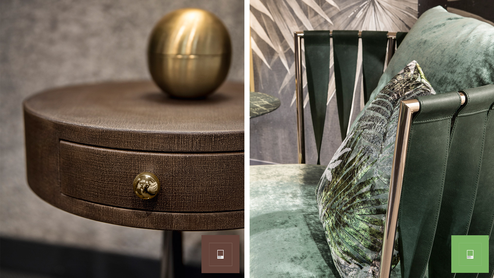
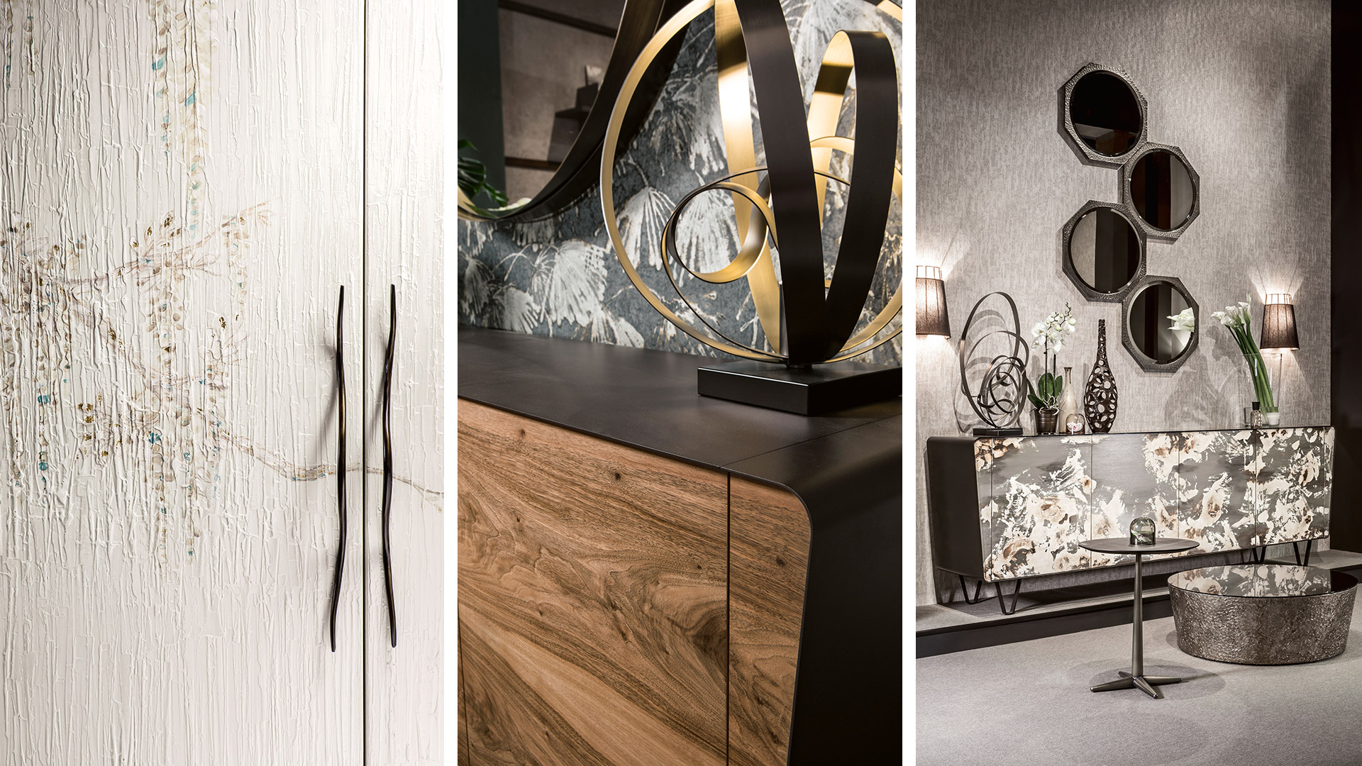
- Golden metals: a bright and elegant touch to the living room.
- Wood: a natural, warm look both in the living room and in the bedroom.
1. Golden metals: a bright and elegant touch to the living room
When choosing gold the goal is to choose the right furnishing elements and details, focusing on what can give rise to a harmonious, balanced picture. Vases and lamps with golden details can be used, for example, to highlight the space; or some furniture elements to add that elegant and bright touch needed to liven up every living area.
2. Wood: a natural, warm look both in the living room and in the bedroom
Wood, to create a natural and warm look both in the living room and in the bedroom. Wooden furniture has always conveyed warmth and hospitality. Better if inserted in contrast with bright colours, resulting in a more balanced final effect. One of the many pros of this material is that it is never out of fashion and gives added value to quality furniture that become the real protagonist of the house. Wood is a very versatile material, suitable for hand decorations using natural paints. This type of furniture will fill your living room with unmistakable and creative details.
È necessario aggiornare il browser
Il tuo browser non è supportato, esegui l'aggiornamento.
Di seguito i link ai browser supportati
Se persistono delle difficoltà, contatta l'Amministratore di questo sito.
digital agency greenbubble